Striptease
The BIG PICTURE: The Importance of Art in Watchmen
|
Watchmen (1986) has gained notoriety as one of comics' most engaging and complex series. Alan Moore, who before Watchmen, had a reputation for creating psychological comics such as Swamp Thing and V for Vendetta, writes it, while Dave Gibbons provides the art and lettering. It is a superhero revisionist story that challenges the reader to draw their own conclusions and take note of hidden elements, while solving a very large puzzle. While the art is consistent in the superhero style of the times, it is the plot and story that is usually seen as groundbreaking material. Watchmen's popularity is therefore often credited to Moore, who, because of it, became somewhat of a spokesman for the adult comics boom in the late Eighties (Sabin 95). But Moore cannot be given all the credit because this is, in fact, a comic book and not a novel. That is to say, there are visual elements to the story that are just as important, if not more so, than the plot. |
In this discussion, I shall analyze the illustration choices and design elements of Watchmen, focusing on the fifth chapter in the series. It will be shown how the reoccurring images and visual themes in the artwork, when combined with the story, result in a challenging reading experience.
It should first be explained that both creators worked together on the series. It was not just a case where the writer hands a finished script over to the artist, who at that point must draw exactly what is stated in the script. There is an apparent amount of research done on both the writing and art, which was used by both creators. This can be seen in the characters of the series, which are loosely based on the Charlton Comics superheroes of the early 60's. There are several stereotyped figures: Dr. Manhattan is the patriotic hero, Nite Owl is the quiet detective, Rorschach is the mysterious vigilante, Silk Specter is the glamorous female heroine, and Comedian is the tough-as-nails war hero. These personas, at least on the surface, were chosen by Moore and Gibbons to be "typical" superheroes. Each time a new character was created, both artist and writer had an impact as to what they looked like, and what personality they had. It is difficult to say, without looking at the script, how much Moore had to do with the artistic choices used in the comics. If the reoccurring visual elements were detailed down to the background elements in each panel, then Gibbons had very little input. But I'm assuming that this was a mutual creative process, and because there is so much going on visually, Gibbons is sure to have brought in many original elements.
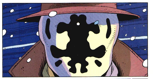
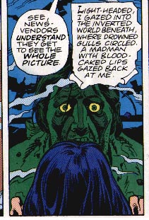
The entire series is an ongoing narrative, and each chapter builds on the previous ones. Chapter five, titled "Fearful Symmetry," focuses on Rorschach and his ongoing search for the killer responsible for the recent deaths of superheroes. Rorschach himself is a very graphic heavy character, using a mask with constantly moving ink within two layers of latex. He gets his name from the Rorschach inkblot tests used in psychological profiling, which is ironic, since he is psychotic. His character is based on the Charlton comics superhero 'the Question' and the self published, 'Mr. A', both created by Steve Ditko (Sabin 271). Gibbons and Moore used these characters as a reference point, drawing on their extreme right wing political nature. In an interview with Moore, he stated that Rorschach was, "a tragic figure, a loser and a fool, who evoked the paranoid world of Steve Ditko, and took vigilantism as far as it could go" (Sabin 271). Much to the creators' disappointment, most fans singled Rorschach out as a hero instead of reacting against him.
Chapter 5, taking from the design of Rorschach's mask, contains many themes and design elements of reflection and symmetry. One example of this is how the entire issue's pages are a mirror image. Page one reflects page 28, page two reflects page 27 and so on. Each page reflects layout and content. The two-page spread on pages 14 and 15 is where the "mirror" exists.
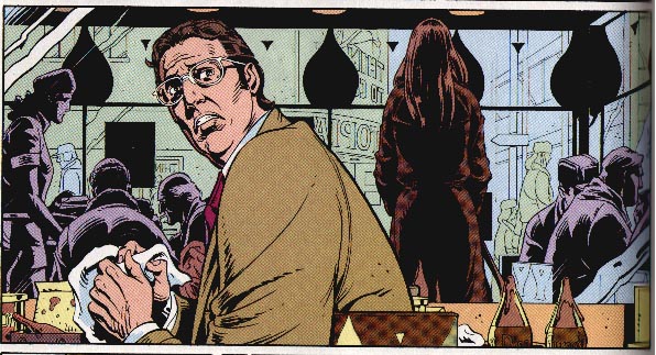
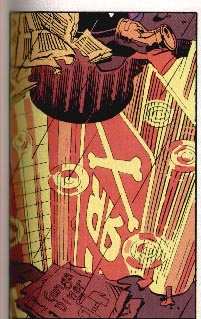
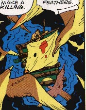
Another example is the frequent use of mirrors or reflective surfaces throughout the issue. From the first page, there is a puddle that reflects the neon sign. The scene with Dan and Laurie in the Gunga Diner (10) is shown mostly through mirrors. Adrian Veidt's office building (13) has reflective floors, furniture, and water in the lobby fountain. There is also a shot of the reflecting water within an image from the Tales of the Black Freighter comic book (12, panel 8).
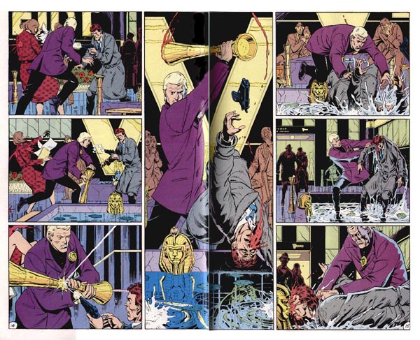
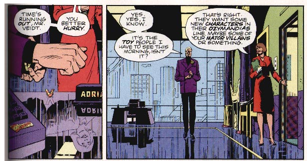
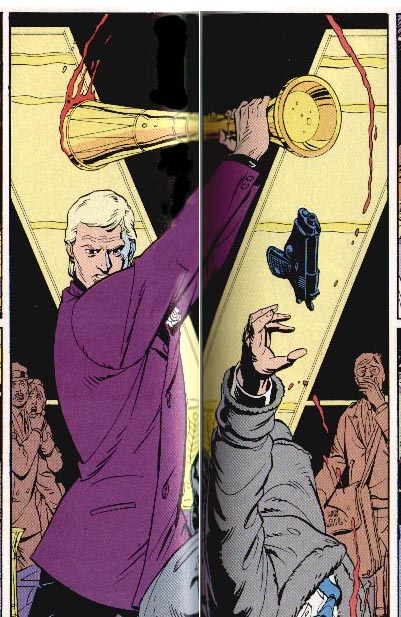
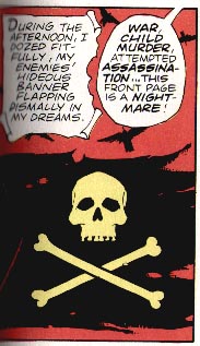
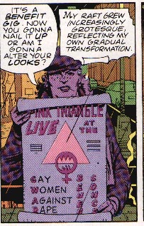
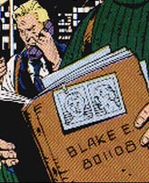
There are also symbols, found throughout the issue, that are symmetric in nature. Veidt's "V" logo has symmetry, and is used as the background of the double page spread (14-15). The skull-and-crossbones graphic, seen in the neon sign and the Black Freighter comic, is a symmetrical image. There is frequent use of a symmetrical triangle, on a murder scene poster (7), a Pyramid Deliveries van (8), and a "Gay Women Against Rape" poster (21, panel 8). Other examples include the button symbols found on Veidt's desk console (13, panel 1), the Grateful Dead album name "Aoxomoxoa" (22, panel 4) is a palindrome, and Blake's case file number "801108" (22, panel 7) is palindromic and contains symmetrical numbers.
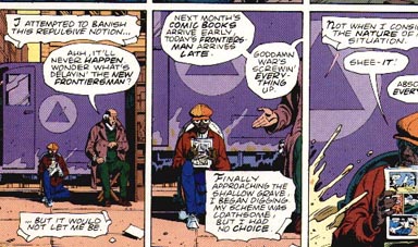
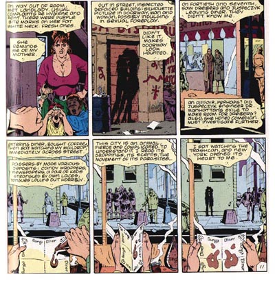
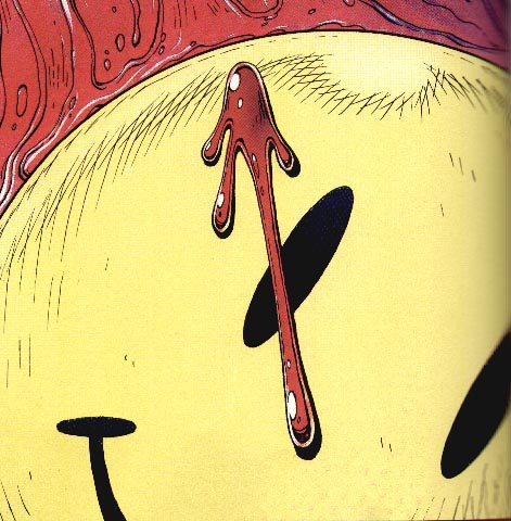
There are also many reoccurring images found within chapter five, as well as the entire series. Some of the previously mentioned symmetrical images, such as the skull-and-crossbones and the triangles, are used several times in the chapter. There is also a graffiti image of a man and woman that appears on several street walls. Rorschach even sees gang members apply the image twice. Another reoccurring image is the bloodstained face motif, which is used throughout the series. It begins with the smiley face button in Chapter One that is stained with the Comedian's blood. In Chapter Five, we find the poster of a Buddha figure (7, panel one) whose face is stained with blood of a murder victim. We also see blood stained on the mast (which looks surprisingly like part of a smiley face) of the castaway's boat within the Black Freighter comic (9, panel 5). Finally, there are the recurring logos for products and photos for people found within this world. Logos for the Gunga diner, apparently a popular food chain, and the Veidt company, such as on Nostalgia cologne, are occasionally seen in the background of panels in every chapter.
So what's the point of symmetrical and reoccurring images found in Chapter Five? Because they are found within shots chosen by the artist, one is lead to believe that they were meant to be seen, and therefore have some significance. This might be true for the reoccurring images, as they are often used as clues to determine location or character identity. They also help to solidify the world that exists within the series. As for the symmetry items, they are mostly there to heighten the impact of Chapter Five's reflection theme. More visual themes are found throughout the entire series and some are more obvious than others. As far as either type of image having a direct effect on the plot, there usually isn't one, except where the found objects are used as clues by characters in the story, which doesn't even happen in Chapter Five.
I believe the main reason for these images to be in Watchmen is to add to the complexity of the "comic-book" experience. The chapter could have very well had the same plot without showing the symmetrical symbols and reoccurring images. The art could have been simpler, the panel layout could have been random, and the basic story would still be the same. But, for one reason or another, the images are there. Either the artist has chosen to put them in the comic, or perhaps they are outlined to be there by the writer. Whoever is responsible, it is clear that they were added to the comic for the same reason that Moore added the text documents at the end of every chapter. These extra, almost extravagant amounts of detail, add to the complexity and challenge of the reading experience. These images are usually subtle, but when they do take up the panel their meaning is not ever clearly explained. But when they are noticed, and recognized by the reader as extra entertaining details, it serves as a kind of reward for the reader. Much like Rorschach is trying to find clues about the killer, the reader is trying to find a relevance of the images to each other, and to the world within the comic.
So why put these images in the comic if they have no relevance to the story? The reader might feel cheated that they even took the time to even notice these images that don't affect the plot. We can ask the same question about superfluous character or scenery descriptions in novels, or even of the news articles and book excerpts at the end of the Watchmen chapters. The answer, as stated before, is to make the finished work a challenging and highly thought-out reading experience. Readers often appreciate and admire the amount of work writers spend on extra details, the same way that artists are respected for engaging visuals. With a comic book, there is the potential to be impressed with both visuals and narrative, but unfortunately this chance is often squandered. In the mainstream superhero comic book genre, one usually dominates over the other. Rarely is there a collaboration of artist and writer that can be credited with creating a highly engaging work of entertainment. However, Watchmen is one of the exceptions to this that most fans and critics agree upon.
It is almost futile to say that the reader reaction to Watchmen is always going to be the same. All readers might not pick up on the visual themes and reoccurring images found within each chapter. Today's comic readers have been bombarded with large panels that usually showcase one major image, and when there is extreme detail, it is rarely linked to an overlying theme. When they read Watchmen, it is hard to say if their attention span will allow them to take in all the extra elements. Then we have the non-comic readers, who might simply be confused by a detailed work like Watchmen. It might take them a while to get used to such an elaborate plot with so many characters. How can they be expected to catch the subtle artistic elements like symmetric panel layout? Once again, it's hard to say for sure, but it's clear that Gibbons and Moore had faith in their intended audience, an older more demanding readership, when creating Watchmen. With respect for the readers evident in the finished work, it can only be hoped that the readers might reciprocate that respect for the writer and artist alike.
WORKS CITED
Atkinson, Doug. The Annotated Watchmen. (1995)
Latta, D.K. "Watchmen." Psycomics (2000)
Moore, Alan, and Dave Gibbons. Watchmen. (New York: DC Comics, 1987).
Sabin, Roger. Adult Comics. (London: Routledge, 1993).
Watchmen, and ALL IMAGES USED are ©™ 1987-2001 DC comics. All views expressed in this paper are those of Chris Daily and do not reflect those of DC comics, Alan Moore, Dave Gibbons, the Pope, martians, Julia Child, the Dutch, small dogs, or your mom. Use of this paper is under the exclusive permission of Chris Daily, so ask, okee? email: toonsniper @ hotmail.com