Striptease
A Formal Analysis of Watchmen
When discussing a piece of art, the viewer is usually looking at one image that is framed in some way by a border. When discussing a comic book, however, the viewer is actually looking at several images, contained in many borders that are melded together to form pages of a story. For the purposes of this discussion, I am only going to analyze the formal elements of the art, and not the story, of three pages from the comic series Watchmen, (1987) by Alan Moore and Dave Gibbons.
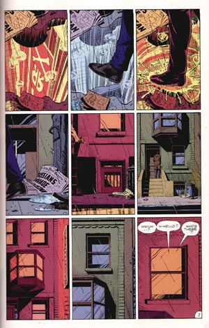
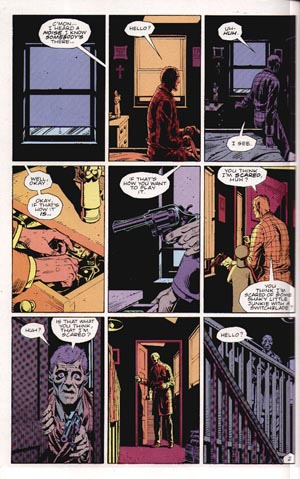
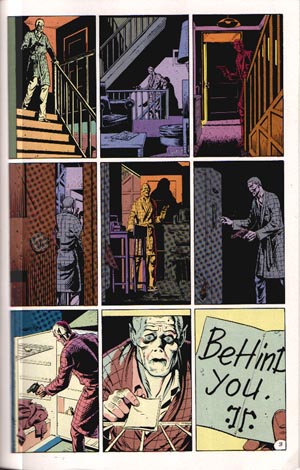
three pages from Watchmen, by Gibbons and Moore
Broken down to its basic format, the comic book is a strategic arrangement of images that tell a story, and these three pages are no exception. All of the pages are broken into nine equal sized panels, with thick borders on the outside, and thin borders in between. They are placed in a grid structure, where every panel is evenly spaced from each other, and justified within the page margins. This makes the reading of the panels very clear, moving from left to right, top to bottom, and then on to the next page. The equal panel size creates a cinematic effect, which allows the viewer to focus more on what is inside the frame, rather than being distracted by the size or placement on the page.
There is also the aspect of timing, which is very important in sequential art such as Watchmen. These three pages are set within a contained amount of time. More importantly, each panel shows a progression of time moving forward, based on elements from previous panels. Without getting into the story, it is suggested that a short amount of time has passed between each panel. This not only creates a sense of pacing for the subject, but also conveys a certain mood to the reader, which in this case, is suspense.
This cinematic progression is further strengthened by the point of view of the viewer in each panel. The positioning of each viewpoint within a panel is a planned storytelling devise to direct the viewer's attention. A good example of this is on the first page where we are directed to look at a newspaper and puddle on the ground. The next panel shows an intrusion by a foot, followed by the water being stepped in. In cinematic mode, the view zooms out to show the paper and puddle next to a wall and a trashcan. Another zoom out shows the wall is part of a larger structure, and the figure that stepped in the puddle is moving up the steps to go inside. Another example of strategic viewpoint is on the third page, which follows the old man as he moves down the stairs. By using the elements within the panels, such as the paper, trashcan, or banisters, the viewer is able to infer that the location on each page is the same, while the viewpoint is changing.
Similar to the panel layout, the art itself shows a consistent line quality and composition. The lines used are predominantly thin, creating a graphic style that is not meant to seem photo-realistic, but also not over exaggerated. The result is a gritty realism, where objects are in proportion and their dimensions are real, yet everything is rendered graphically. There is a good amount of hatching used to convey texture, especially on the third page with the hallway rug and the door. The man's skin, seen in close ups of his hand on page 2, and his face on page 3, also features lines to indicate wrinkles and aging conditions. The compositions of most panels have a central image that the viewer can look at. None of them are blank, or so detailed that the subject can't be made out. The level of complexity meets in the middle, showing features outside and inside an apartment building. Because there is so much architecture shown, there are often panels within the panels, created by the windows, doors, and the banister railing.
The use of color and shadow should also be pointed out, as they each strengthen other formal elements previously discussed. The coloring in these pages adds emphasis to the use of timing. This is due to the neon sign shown on the first page, which becomes a coloring source for each panel. There is an on again/off again pattern of warm colors and cool colors, suggesting that the sign is blinking at some interval of time. This affects both the outside elements of the first page, but also the interior colors on the second and third pages. The shadows on these pages aid in determining depth and viewpoint. Most of the shots show the old man at the same distance from the viewer, and the shadows convey space and unknown elements. The shadows, combined with the neon sign colors, suggest that the scene takes place at night, which also heightens the suspense element in the story.
These three pages from Watchmen are prime examples of formal elements in comics that have been precisely chosen to create the desired scene. The strict organization of panels and line, consistency of timing and colors, choice of cinematic viewpoints, and placement of shadows allow the viewer to know many things about the subject and story. No one element is overpowering, and yet all are essential in creating the look of the piece. Because the formal elements are used in such specific ways, any changes in line, color, point of view, and panel layout would create an entirely different story, and arguably, a different comic. For that reason, I believe the forms displayed in these pages give them, and the entirety of Watchmen, a unique quality of storytelling.
Watchmen©1987 DC comics all views expressed in this paper are those of Chris Daily and do not reflect those of DC comics, Alan Moore, Dave Gibbons, the pope, martians, Julia Child, the Dutch, small dogs, or your mom. Use of this paper is under the exclusive permission of Chris Daily. email: toonsniper @ hotmail.com